
Using Palladio to Visualize Ads
This page discusses the geographic digital tool Palladio and its use to visualize paths of runaway slaves collected from jailers’ notices.
Rationale
Scholarship on fugitive slaves has identified several geographic trends in the directions taken by runaways. Some slaves temporarily “laid out” in the vicinity of their owners’ farms or plantations, while others ran farther with the intent to stay with relatives or to reach freedom. Franklin and Schweninger’s research found that “slaves living in the Lower Mississippi River Valley or in Mississippi and Alabama were more likely to run south and west than north,” making Texas and Mexico possible destinations for runaway slaves (Franklin and Schweninger, 112).
After a close reading of runaway slave advertisements from Texas, Mississippi, and Arkansas newspapers, we hypothesized that Texas had different runaway destination patterns than the other two states. William Dean Carrigan, in his article “Slavery on the Frontier: The Peculiar Institution in Central Texas,” portrays Texas as “a world torn in three directions by four different cultures” (Carrigan, 64). Both the presence of Native American tribes and the proximity of Mexico helped to define Texas as a borderland through which many slaves passed to get to freedom.
In terms of the other states, many jailers’ notices in Arkansas advertised captured slaves originally from states to the east, indicating that Arkansas was also a popular destination or point on the route to freedom. Out of the three states compared in this research, Mississippi is the most representative of a typical Southern slave-holding state, in that it was well-established and not a borderland state. From these patterns of advertisement in relationship to other states, Mississippi provides a barometer of normalcy that allows comparison of differences in Arkansas and Texas.
However, the trends we discovered through close reading have their limitations. As an initial method of familiarizing ourselves with the data, close reading is beneficial, but it is difficult to find patterns by simply reading through a corpus of runaway slave advertisements. In only a few advertisements did slave owners mention locations where their slaves might be running. Even when a slave owner did mention a destination, that location often only represented where the owner guessed the runaway was headed. One slave owner in an 1836 ad from the Arkansas Gazette was more candid than most when he said, “I have dreamed, with both eyes open, that he went toward the Spanish county; but as dreams are like some would be thought honest men―quite uncertain―he may have gone some other directions.” Even when they did not directly state it, however, slave owners did subtly acknowledge their lack of complete knowledge on where their slaves were headed.
One source of available information that provides a truer sense of runaways’ start and end locations is jailers’ notices, a data set that Franklin and Schweninger did not utilize in analyzing slaves’ projected destinations. Many jailers’ notices contain information about where the slave had run from or where his or her owner lived. Although we generally cannot tell which routes runaway slaves took to get to their destinations, simply connecting points between their start locations and where they were captured gives us an idea about where they were heading. The web application Palladio enabled us to visualize these potential paths.
Methodology
To create our maps using Palladio, we first chose two sets of jailers’ notices from each of the states. Jailers’ notices were the best choice for visualizing runaway paths because they almost universally list the owner’s location as reported by the runaway, thereby providing two locations for mapping: the county jail and the reported owner location. The Bexar, Pulaski, and Jefferson county jails provided a suitable sample, since they each had a similar number of advertisements (about 20) and were all from the late 1850s. In addition, we used the set of all jailers’ notices advertised in each state over the years 1840 to 1842 in order to have a random sample set not limited by county jail.
We then manually entered geographic data from these three samples into a spreadsheet. The spreadsheet stored information on the owner’s location as reported by the slave and on the location of the county jail where the runaway was held after being captured. We also created a spreadsheet containing the geographic coordinates for each listed location.
Next, we uploaded our data to Palladio for visualization. Merging the “from” and “to” locations with geographic coordinates allowed us to begin visualizing the data. We choose the “Point to Point” option for map type in order to represent the directions taken by runaway slaves. By creating separate maps for each state, we were able to draw conclusions about differences in runaway patterns across the South.

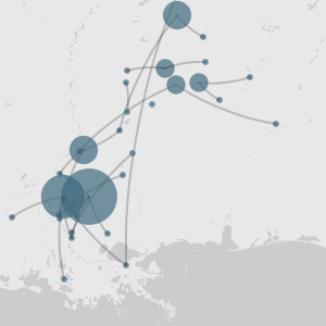
Map of Pulaski County jail, Arkansas
Although Palladio’s features are currently limited, one that proved useful to us was the “Count by” option. Shaded circles of varying sizes depict the frequency of each location in the data set, as shown in the following image.

Mississippi 1840-42
Conclusions
Using Palladio as a tool for both visualization and analysis, we produced the following results from the data sets.
 As shown above, jailers’ notices between 1840 and 1842 follow no discernible pattern, and the maps are difficult to interpret. The maps could potentially be made more readable through the addition of arrows in order to indicate the direction taken, but currently Palladio does not have this capability.
The maps created from the data for individual county jails, however, proved much more informative. By juxtaposing maps of start and end points from Arkansas, Mississippi, and Texas jailers’ notices, we observed striking differences in the patterns of runaway paths across states.


A clear argument is contained in the above images. The maps of Arkansas and Mississippi indicate that runaways came from a variety of directions and without any significant pattern. The map of Texas, however, suggests that fugitive slaves caught in that region had almost universally run southwest, presumably toward Mexico. Our data supports our hypothesis that Texas had patterns of runaway slave paths different from those of other states.
There are some limitations of our data, however, stemming from the sources themselves. Listed locations in jailers’ notices varied in specificity, from city-level to county-level to relative locations. For some, we were unable to find the coordinates for a historic location, so we listed those data points on the county-level instead.
Another confounding factor that may limit our conclusion of the differences in Texas runaway patterns is that few slaves lived west of the Bexar County jail in San Antonio, the data set we used to produce the Texas visualization. This suggests that source locations would generally be from the east. With more transcribed jailers’ notices in hand, we could observe how runaway paths ending in Houston compare, since, under a hypothesis that there is no pattern, there would be comparable numbers of runaways from locations such as Austin and San Antonio (to the west), Corpus Christi (to the southwest), and the rest of the surrounding geography. If the pattern of runaway attempts to the southwest continued, we would have stronger evidence to support our conclusions.
Additional limitations lie in the digital tool itself. Palladio is in the process of being updated, so hopefully the user interface will become more friendly in the future. Currently, embedding the visualizations into a website is not an option, so we have been forced to use screenshots to present our results. In addition, the number of visualization options are limited. For example, the underlying map does not have the possibility of adding state boundaries for more clarity. Another disadvantage of working with Palladio lies in the fact that data collection is manual, and therefore time consuming.
An alternative to Palladio is Google Maps, which would allow embedding of the resulting images and more advanced visualization options. However, the point to point lines would have to be drawn by hand, which would be labor intensive, especially given the size of the data set.
Future work in Palladio would primarily focus on collection of different samples in order to corroborate our points and to create additional persuasive visualizations. Another possible extension would be the use of data from runaway ads, as opposed to from jailers’ notices. We could potentially find a hub location and use all fugitive slave ads that included projected runaway directions from that county as source data.
Our findings from this evidence provide a starting point for continued research. The work accomplished suggests that Palladio is a beneficial digital tool in the geographic visualization of evidence. Further improvements in the program will allow for explorations both in and beyond our current data set. Palladio’s contributions to the digital humanities will ultimately expand possibilities of analysis previously unavailable to historians.